
Google Announces A New Algorithm Will ‘Significantly Impact’ Web Sites Without Mobile Compatibility
It’s now official and will take effect on April 21st, 2015. It’s unprecedented for Google to provide a public timeline for an update of this magnitude to help encourage businesses to find a professional developer to make this transition.
We’ve known for many years that Google, the Queen of the internet, who sets the rules and guidelines for us web developers and Search Engine Optimization specialists to follow, wants all websites to be mobile friendly. With over 60% of web traffic coming from the web this makes a lot of sense.
In plain English, this means that websites with mobile compatibility and mobile app connectivity will be awarded higher rankings in search results than those sites without.
According to the announcement on its Webmaster Central blog, Google said:
“Starting April 21, we will be expanding our use of mobile-friendliness as a ranking signal. This change will affect mobile searches in all languages worldwide and will have a significant impact in our search results. Consequently, users will find it easier to get relevant, high quality search results that are optimized for their devices.”
What does that mean for you exactly? In short, if your website is not mobile-friendly, meaning your site is not responsive to different screen sizes, properly configured and able to be viewed on multiple device types, Google is making plans to penalize your search rankings. All the valuable SEO your site has currently could be for naught if your site isn’t viewable on a mobile device.
The reasoning for this update is simple. As the world moves to mobile and more and more of our lives occur in a handheld device, it is critical that websites are able to keep up. By rewarding those sites which are mobile friendly, Google is continuing to shape the digital landscape.
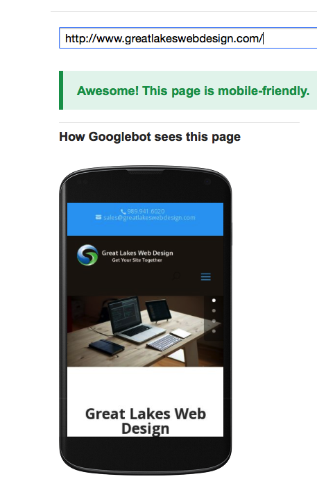
How Do I tell If My Site Is Mobile-Friendly?
- Check your site’s SERP appearances. While searching Google on your phone or tablet you may have noticed the new mobile-friendly tags inside some results. Hopefully your website shows up in these search results. If it does you have nothing to worry about. if it doesn’t continue to read!
- Run your site through Google’s Mobile-Friendly Test. Simply enter your URL into the grader. You can also check the Mobile Usability Report within your Google Webmaster Tools account for additional details on mobile compatibility issues across your site
Get Your Site Together
If your site doesn’t pass the test it’s time to get it together.
You can always have an SEO specialist from Great Lakes Web Design of Midland, MI take a look at your site for free. Every site we make is designed and developed from the ground up to be responsive on every screen size. Our developers also pay close attention to trends and industry news to account for the screens size and resolutions being released for years to come.
Phone: 989.941.6020